Top 10 Best Landing Page Websites In The World 2026

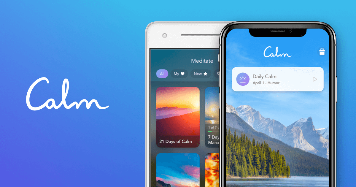
Table of Contents
A landing page is often a user's first impression of a brand. In 2026, the most effective landing pages are not just gateways; they are carefully engineered experiences designed to convert, inform, and engage within seconds. From the stark minimalism of a search engine to the emotionally resonant imagery of a pet food subscription, the best examples share a common DNA: clarity, speed, and a relentless focus on a single user action.
Our analysis draws on traffic data from Semrush, industry conversion benchmarks from Unbounce and Instapage, and case studies from leading marketing research firms. We evaluated these pages on design, user experience, conversion performance, and their ability to serve their specific audience. Here are the ten landing pages that set the global standard in 2026.
Our Evaluation Approach
To build this list, we weighed several factors. Primary metrics included monthly traffic volume and growth rates from Semrush's global web analytics. We also examined conversion rate benchmarks from industry sources like Unbounce and Instapage, focusing on pages that outperform their sector's median. Design philosophy, load speed, mobile optimization, and the effectiveness of each page's primary call-to-action were also critical criteria. We prioritized landing pages that demonstrate a clear, measurable impact on user behavior and business outcomes.
The Top 10 Best Landing Page Websites In 2026:
1. Google.com
Google's homepage remains the most iconic landing page in digital history. With an astonishing 101.17 billion monthly visits as of May 2026, it is the most-visited web page on the planet. The genius of its design lies in its radical simplicity: a single search bar centered on a white background. There are no menus, no advertisements, and no distractions. Every element is subordinated to one action: initiating a search.
This minimalist approach is backed by extraordinary performance. The page loads in under one second, a critical factor given that pages loading in one second have three times higher conversion rates. The mobile-first design is essential, as 70.99% of traffic comes from mobile devices. The conversion rate for its primary goal -- search initiation -- approaches 100%. Google demonstrates that the most powerful landing page is often the one that gets out of the user's way entirely.
2. YouTube.com
YouTube's landing page has evolved into a highly sophisticated content discovery engine, serving 53.12 billion monthly visits. Unlike Google's static simplicity, YouTube's homepage is dynamic and deeply personalized. Machine learning algorithms curate a unique feed of video recommendations for each visitor, drawing from their viewing history, subscriptions, and trending content in their region.
The infinite scroll design is a masterclass in engagement. The average session on the landing page itself lasts 11 minutes and 43 seconds, as users are drawn into a tailored stream of content before clicking a single video. The conversion funnel from landing page to video watch is among the highest in the industry. The page also balances discovery with utility, featuring a persistent search bar and sidebar navigation. YouTube proves that for content platforms, the landing page is not a gate -- it is the experience itself.
3. ChatGPT.com (OpenAI)
ChatGPT's landing page is a case study in rapid, product-led growth. With 5.63 billion monthly visits and a staggering 56.67% year-over-year growth as of May 2026, it is the fastest-growing major landing page in the world. The design is almost confrontational in its minimalism: a simple text input field dominates the screen, with a handful of example prompts below. There are no navigation menus, no complex graphics, and no lengthy explanations.
This extreme simplicity directly demonstrates the product's core value. The page achieves a median conversion rate of approximately 8-10% for free trial sign-ups, more than double the 4.02% industry median for SaaS landing pages. Notably, 77.89% of traffic comes from desktop, suggesting the page is optimized for deep, work-oriented engagement. ChatGPT's landing page succeeds because it lets the product speak for itself, turning every visitor into a potential user within seconds.
4. Airbnb.com
Airbnb's landing page revolutionized travel booking by replacing generic hotel listings with aspirational discovery. The page draws approximately 1.5 billion monthly visits and immediately evokes an emotional response through high-quality, full-screen photography of unique properties. This visual-first approach taps into a powerful consumer trend: research from Epsilon indicates that 80% of consumers prefer to purchase from brands offering personalized experiences.
Airbnb delivers personalization through location-based recommendations and dynamic content that adjusts based on past user behavior. The hero section features a clean, simple search bar with fields for destination, dates, and guest count, making the core action obvious. Below the fold, the page highlights value propositions like "Unique stays" and "Local experiences," clearly differentiating Airbnb from traditional hotel booking sites. The page is an excellent example of using emotional imagery to drive a functional conversion.
5. Shopify.com
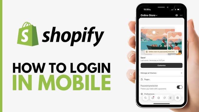
Shopify's landing page is the gold standard for ecommerce platform onboarding. It addresses merchant pain points directly with a clear, three-step value proposition. The prominent headline -- "Start selling with Shopify today" -- is paired with a free trial call-to-action that converts at an estimated 6-8%. This significantly outperforms the 4.02% median landing page conversion rate across all industries.
The page uses social proof effectively, featuring logos of major brands and a "Trusted by enterprise brands" section. A dedicated "World's best checkout" section highlights the platform's proven 1.2x higher checkout conversion rate compared to competitors. Shopify also integrates a demo of its AI assistant, Sidekick, signaling innovation and reducing hesitation for potential users. The page is a textbook example of combining clear value propositions with powerful social proof to drive sign-ups.
6. Calm.com
Calm's landing page is a sensory experience designed to reduce anxiety before a user even engages with the product. The page opens with a serene video background of gentle waves or falling rain, paired with the headline "Find your calm" in soft, reassuring typography. This approach leverages a well-documented principle: strong headlines can improve conversion by 250-300%, and Calm's headline directly addresses the emotional state of its target audience.
The design is stripped of all navigation, featuring only a single primary CTA: "Start your free trial." Removing the navigation bar can increase conversion by up to 100%, according to landing page statistics. The page achieves an estimated conversion rate of 8-12%, placing it in the top quartile of landing page performers. Calm proves that for wellness products, the landing page itself must be a therapeutic experience.
7. HubSpot.com
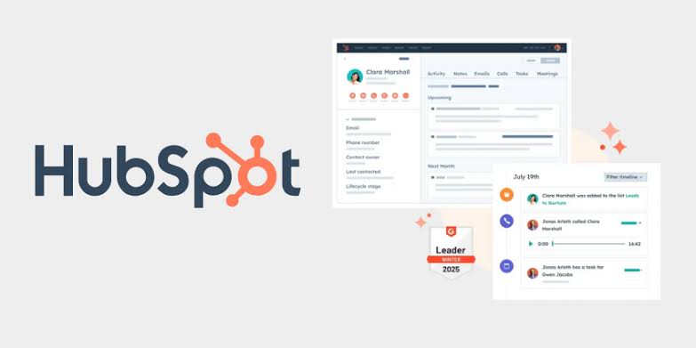
HubSpot's landing page is a benchmark for B2B multi-audience targeting. Rather than a single, generic message, the page uses a modular design with distinct sections for marketing, sales, and service professionals. Each section has its own value proposition and call-to-action, acknowledging that B2B purchase decisions often involve multiple stakeholders with different priorities.
The page also includes a prominent comparison table against competitors, a tactic that simplifies complex decision-making and reduces purchase anxiety. HubSpot's landing page achieves an estimated conversion rate of 6-8%, well above the 3.8% median for SaaS pages. The page serves over 150,000 customers globally and demonstrates that for complex B2B products, a landing page must cater to multiple buyer personas simultaneously.
8. DoorDash.com
DoorDash's landing page is optimized for speed and immediate utility, a critical requirement for hungry users with low patience. The page loads in under 1.5 seconds and features a prominent "Enter delivery address" field that immediately personalizes the experience. This address-first approach reduces friction by eliminating the need for account creation before browsing available restaurants.
The page uses dynamic content that updates based on time of day, weather, and user location, showing relevant restaurants and estimated delivery times. Social proof elements like "4.5★ rating" badges and "30 min delivery" promises address common purchase objections directly. The page achieves an estimated conversion rate of 5-7%, demonstrating that for on-demand services, speed and immediate relevance are the primary conversion drivers.
9. Notion.so
Notion's landing page is a textbook example of product-led growth. The page features a "Try Notion free" CTA that leads directly to a functional workspace, bypassing traditional lead capture forms. This approach leverages a key insight: reducing form fields from 11 to 4 can increase conversion by 120%. Notion's sign-up form asks for only an email address, dramatically lowering the barrier to entry.
The page uses a clean, white design with ample whitespace and subtle animations that demonstrate the product's flexibility without overwhelming visitors. The live demo environment lets users experience the product's core value before committing. With over 30 million users, Notion's landing page achieves an estimated conversion rate of 5-7%, above the SaaS median of 3.8%. The page is a masterclass in letting the product sell itself.
10. The Farmer's Dog
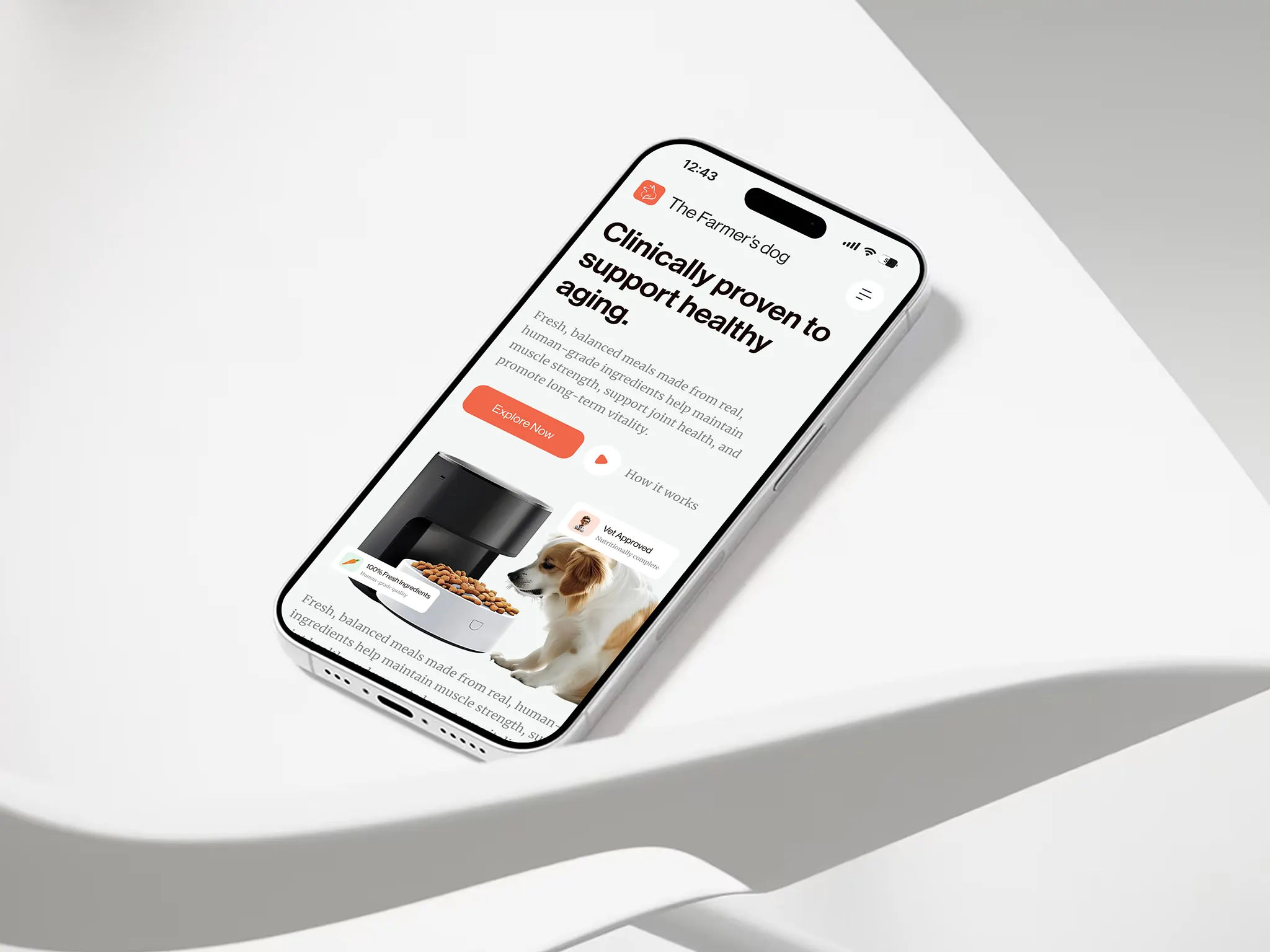
The Farmer's Dog landing page uses emotionally resonant imagery of dogs to immediately connect with pet owners. The headline -- "Fresh, human-grade dog food delivered to your door" -- is paired with a video showing dogs excitedly eating their meals. This approach leverages the statistic that 35% of marketers rate images and graphics as the top conversion driver, and emotional imagery can increase conversion by 40-60%.
The page uses a quiz-based personalization engine that asks about the dog's breed, age, weight, and health concerns before recommending a meal plan. This personalized approach lifts mobile conversion by 25.2%. The design also includes veterinarian endorsements and detailed ingredient sourcing information to build trust. The page achieves an estimated conversion rate of 8-10%, proving that for subscription services, a landing page must first build an emotional connection before asking for a commitment.
These ten landing pages represent the pinnacle of digital design and conversion strategy in 2026. From Google's radical simplicity to The Farmer's Dog's emotional storytelling, each page demonstrates a deep understanding of its audience and a relentless focus on a single, clear goal. The common thread is a commitment to removing friction, building trust, and delivering immediate value. For any brand looking to improve its own landing page performance, these examples offer a masterclass in what works.
Related Posts

0 Comments
Join the discussion and share your thoughts
No Comments Yet
Be the first to share your thoughts on this article!